Design & styles
Select any element and open its Design tab. Everything reads in plain language, no CSS required, but the full stylesheet is there when you want it.
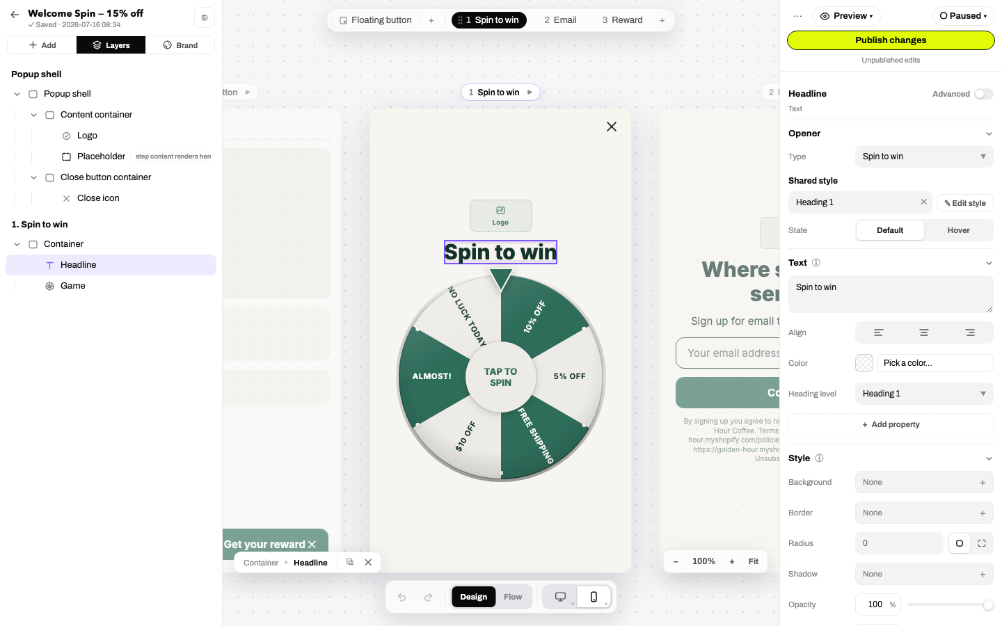
Where edits land: devices, states, breakpoints
In simple mode you think in two ideas:
- The canvas device toggle decides the breakpoint: edit with mobile selected and you're styling all screens; switch to desktop and your edits become desktop-only overrides.
- The Default / Hover state segment routes edits to the resting look or the hover look.
Flip on Advanced for explicit chips (All screens / mobile / desktop / Hover) when you want surgical control over exactly which bucket a property lives in.
Shared styles
Text, buttons and inputs can link to a shared style from your brand's style libraries: change the style once and every linked element updates. The picker at the top of the Design tab lets you link, unlink-but-keep-the-look (✕), create a style from the element's current local styles (+), or jump to editing the style itself. Local edits on top of a shared style act as overrides.
Text
Words, font (from your brand fonts or any Google Font), weight, size, alignment, color, plus line height, letter spacing, case, italic and underline. The heading level control (H1 / H2 / H3 / Paragraph / Inline) sets semantics for screen readers independently of how big the text looks.
Layout (containers)
- Direction (→ / ↓) and Distribute (Packed / Spaced).
- Gap, plus one-click spacing presets: Compact / Cozy / Roomy.
- A 3×3 alignment grid: click where children should anchor.
- Order (forward/reverse), wrap, overflow, with the raw display/justify/align properties in Advanced.
Style
Background (image, solid color, or gradient; the picker can reference brand colors so palette swaps recolor everything), border, radius, shadow, an opacity slider and a rotate slider (−180°…180°). Icons add an icon-color field. Filters, clip paths and masks live under Advanced.
Use as background
When an image sits inside a container, its panel gains Use as background: one click promotes the image into its container's background and removes the standalone image element. It's the clean way to turn a hero image into a full-bleed backdrop with text on top, instead of layering elements by hand. (The canvas right-click menu offers the same thing.)
Spacing & sizing
- The spacing section is a visual box model: padding (inside, green) and margin (outside, blue); click a side and scroll or type.
- Width and height use Fill / Hug / Fixed chips (fill the parent, hug the content, or set a number), with min/max/expand/shrink in Advanced.
Positioning & visibility
- Position: default flow, relative to container, fixed, or sticky, with X/Y anchors (left/center/right, top/center/bottom) plus pixel offsets and z-index.
- Visibility: per-device show/hide chips, the clean way to run different art on mobile vs desktop.
Animation
Entrance animation per element: fade-in (plus down/left/right/up variants), zoom-in, slide (four directions), pulse, shiny, drift, flicker, each with duration and delay in milliseconds. See the whole popup move by switching the canvas to Preview mode. Visitors with reduced-motion enabled get opacity-only entrances automatically.
Edit CSS
In Advanced mode every element gains an Edit CSS section: raw property rows applied on top of everything above. It's scoped to the element, so you can't break the page, just your popup. If you're reaching for it constantly, consider a shared style instead.
The popup root
Select the popup shell itself for root options: Fullscreen vs Centered card position (each remembers its own sizing), modal behavior, background scroll-lock, transparent backdrop, and the campaign-wide consent text blocks with their legal-link variables.