Brand kit
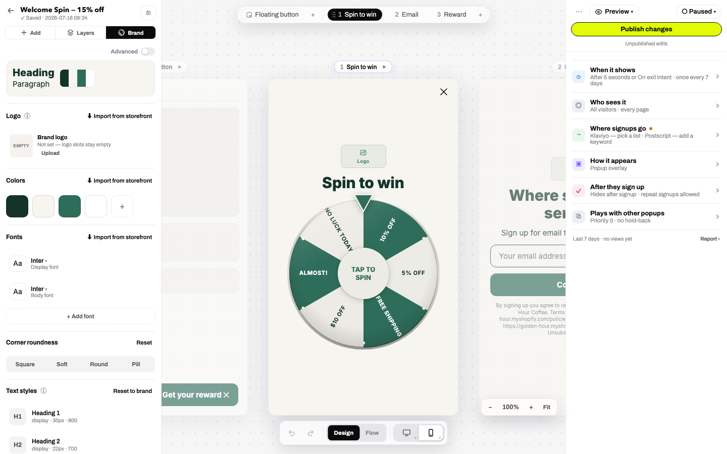
The Brand tab is your popup's design system: colors, fonts, corners, logo and reusable styles. Elements reference these tokens, so swapping the palette restyles the whole popup in one move.
Logo
Upload, replace or remove the brand logo; every empty Logo element in the popup shows it automatically. ⬇ Import from storefront finds and self-hosts your live site's logo.
Colors
Four core roles (text, background, accent, accent foreground) plus any extra swatches you add. Style controls throughout the builder can point at a color role rather than a hex value, which is what makes palette swaps instant. A contrast warning appears when a text/background pair falls below the accessibility minimum.
Fonts
A display font for headlines and a body font for everything else, picked from a searchable Google Fonts catalog (or imported from your storefront). Advanced mode accepts a custom font-stylesheet URL for licensed webfonts.
Corner roundness
Square / Soft / Round / Pill: one decision that flows into buttons, inputs, cards and the popup shell (custom values in Advanced).
Style libraries
Named, reusable styles in three kinds: Text styles (H1, H2, Paragraph…), Button styles, Input styles. Each row expands into an inline editor with a live sample and shows how many elements use it. Link any element to a style from its Design tab; edit the style once and every linked element updates. Reset to brand rebuilds the defaults from your tokens.
Import from storefront
Every section carries ⬇ Import from storefront: Janus reads your live site's CSS and assets to extract colors (classified into the four roles), fonts (mapped to loadable equivalents) and the logo (downloaded and self-hosted, never hotlinked). The same engine powers the wizard's Brand step and Settings → Branding defaults. Details: Importing.
Brand defaults for new popups
Set your house brand once in Settings → Branding defaults; it becomes the "Your brand" starting point in the wizard's template step, so every new popup begins on-brand instead of on-template.