Visual builder tour
The builder is a full design tool for popups: every step on one canvas, a page navigator with live thumbnails, brand tokens, a flow graph and a playable preview. This page is the map; the deep dives are linked throughout.
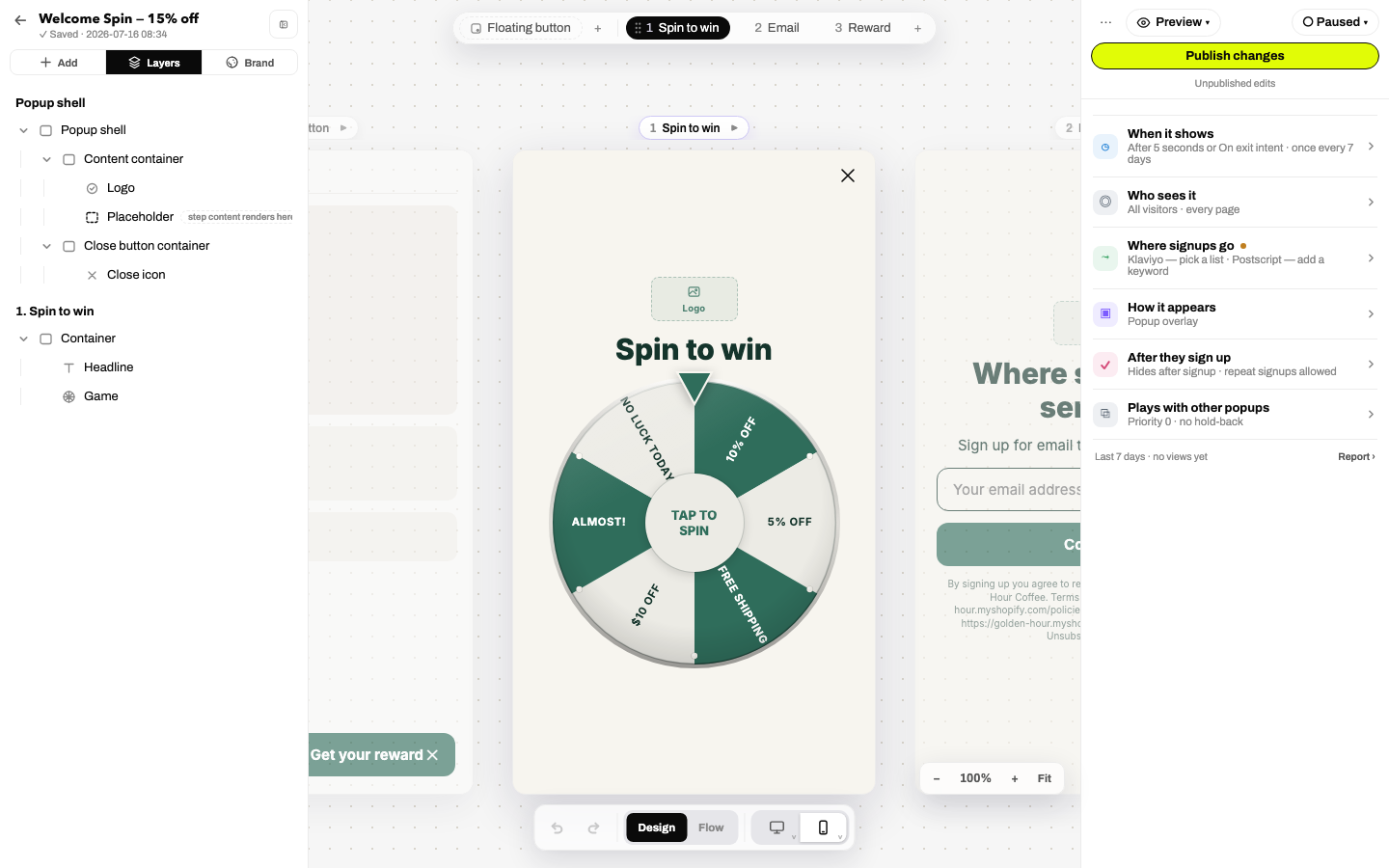
The layout
- Nav rail: a slim icon rail on the far left (hover any icon for its name): Add (the element library), Editor (the Pages & Layers panel), Brand (the brand kit), and Insights (exits to the campaign page). Clicking the active icon collapses the panel so the canvas gets the full width.
- The panel: hosts whichever section the rail selected, under the campaign name (autosaves as you type) and the saved-state line. ← saves and exits.
- Canvas: all steps render side-by-side as device frames. Click a column to focus a step, click any element to inspect it, drag to move or nest, right-click for the context menu. A breadcrumb bar bottom-left shows the selection's ancestor chain with quick ⧉ Duplicate / ✕ Delete.
- Inspector: on the right. With an element selected: its name, a Content tab (type-specific settings), a Design tab (the style system) and an Interactions tab (the action editor). With nothing selected: Campaign Home, collapsible summaries for When it shows (triggers), Who sees it (targeting), Where signups go (integrations), How it appears (overlay vs inline embed) and After they sign up.
Pages & Layers
The Editor panel has two tabs:
- Pages: the steps of the campaign, as a vertical list of live thumbnails that repaint as you edit. The teaser-button step sits in its own section. Click a step to focus it, double-click to rename, drag to reorder, and use the ⋯ step menu for clone, parallel branch and delete. A ! badge marks orphan steps no arrow leads to. Add step opens the grouped catalog: clones, blanks, openers (quiz, yes/no and every game), email and phone collection, and offer steps. Full detail: Steps, branches & flow.
- Layers: the element tree of the current step: drag to reorder or nest, collapse branches, right-click for the full menu. Multi-select here to style or delete many elements at once.
Three canvas modes
The bottom toolbar switches the canvas between:
- Design: the editing surface described above.
- Flow: the routing graph: every step as a card, every route as an arrow you can drag to rewire. See the Flow view.
- Preview: the real widget, playable, inside a desktop or phone frame. Games actually spin, forms validate, and the offer step reveals a stub code, with the network stubbed, so nothing you do here counts as a signup or fires a pixel. ↺ Restart replays from step one.
Zoom & devices
- Zoom: ⌘/Ctrl+scroll zooms toward your cursor; the pill has − / % / + / Fit (⌘0 resets).
- Devices: Desktop and Mobile toggles; turn both on to see each step in both sizes at once. Which toggle is active also decides where style edits land. Hover a toggle to pick an exact device preset (iPhone SE → 15, Pixel, small laptop → 4K).
Keyboard shortcuts
| Keys | Action | Keys | Action |
|---|---|---|---|
| ⌘Z / ⇧⌘Z | Undo / redo | ⌘D | Duplicate selection |
| ⌘C ⌘X ⌘V | Copy / cut / paste | ⌫ | Delete (multi-select aware) |
| ⌘S | Save now | Esc | Deselect / close menu |
| ⌘+ ⌘− ⌘0 | Zoom in / out / reset | Arrows | Nudge position (⇧ = 10px) |
In the Add element modal, single letters insert elements: 1/2 headings, T text, I image, S submit, B button, F form, E/P/N email/phone/name inputs, D discount, Q question, A answer.
Autosave, undo & versions
Every edit autosaves to your draft within about a second; the header shows Saving… → ✓ Saved. Undo history is generous, and a multi-delete restores as one undo. Every publish takes an automatic snapshot, and you can save named checkpoints that are never pruned; browse and restore them on the campaign page's History tab (or ⋯ → Version history…). Restoring always writes to your draft; it never silently changes what live visitors see.
Preview on your store
The Preview ▾ menu:
- On your live site: your real storefront in a device-framed pane (mobile / tablet / desktop) with the popup rendered on top, updating live as you edit. A time machine strip simulates visitor state (1st/3rd/10th visit, $0/$60 cart, 0s/30s on page) and renders a "would show / would NOT show" verdict with the exact passing and failing conditions. It's the fastest way to sanity-check targeting and triggers.
- Preview any URL: the same live preview pointed at any page you paste in.
- On your phone: a QR code that opens the preview on your actual phone. No app, no setup: scan and it's in your hand.
Publish & status
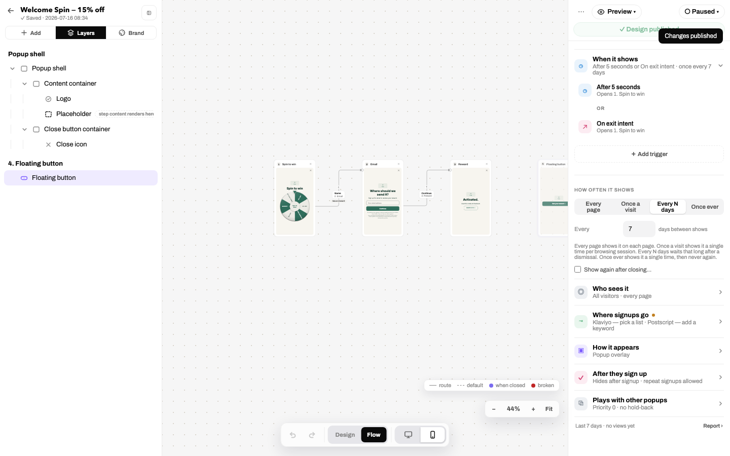
Edits reach visitors only when you press Publish. The subline underneath tracks state (Unpublished edits · N issues to fix), and clicking an issue jumps straight to the offending element. Publishing while the campaign is paused tells you so ("Published, but the campaign is paused, so nobody sees it yet") with a one-click Set live. The ⋯ menu holds Version history…, Export design… / Import design…, Save to your templates and Revert (discard draft changes).
The ready check
Publishing runs a two-tier check:
- Blockers (publish stops until fixed): no steps; a form with no submit button; the popup promises a reward but none is configured; a step routes to a deleted step; a phone input with no SMS consent disclosure; an empty structural image slot; targeting that references a deleted segment. Publish anyway exists for the rare deliberate exception.
- Advisories (never block): accessibility findings (low contrast, missing alt text, unlabeled controls, skipped heading levels), heavy images (>200 KB) and total page-weight warnings, a game placed before contact capture, unreachable steps, low import fidelity, and small-screen overflow.
Clean up (imported popups)
Popups that came in through the importer get a Clean up broom in the left panel; it glows when there's something to tidy. It scans the design and groups its findings under Layers, Spacing, Text and Positioning; an optional Also fix layout issues checkbox opts into deeper fixes that can shift how things look (un-clipping cut-off text, re-flowing floating elements). Everything applies as one undoable step.