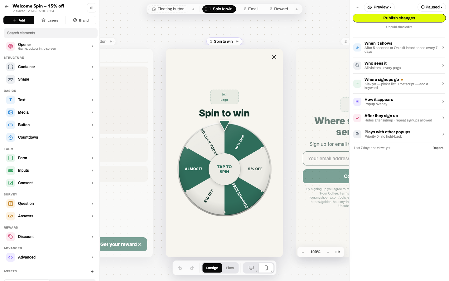
Everything you can put inside a popup. Open it from the Add tab: hover a category for live-preview tiles that render in your own brand colors, then click to insert or drag straight onto the canvas.
The Add panel. A search box flattens the whole catalog into one filtered grid.
Structure
Element
What it does
Column
A container that stacks its children vertically.
Row
Lays children out side by side.
2 columns
A row of two equal columns.
Shape
A decorative edge band from a 20-pattern library (waves, arches, slants, blobs, bubbles, spikes…). Settings: placement (top of popup / bottom / in layout flow), fill from a brand color, horizontal/vertical flip, and keep-or-hide on mobile.
Containers gain layout controls in the inspector (direction, distribution, gap, spacing presets, a 3×3 align grid, wrap) plus Randomize child order (shuffle per visitor) and an options editor when acting as a quiz choice group. See Design & styles.
Basics
Element
Settings
Heading 1 / Heading 2 / Text / Inline text
The words, plus full typography controls. The heading level control (H1/H2/H3/Paragraph/Inline) sets screen-reader semantics independent of visual size. Inline text flows beside sibling inline text. All text supports variables like {{reward}}.
Image
Choose/replace from the asset library (uploads or Shopify files), URL field, alt text. Logo elements fall back to the brand logo automatically.
Icon
A glyph with its own color control.
Submit button
Submits the enclosing form, then runs its action chain (default: next step). Label + optional left/right icons.
Plain button
A button with any actions: go to step, close, open URL, issue reward, branch…
Tap to text
Opens the visitor's SMS app with a prefilled message to your number. Settings: label, number, prefilled text.
Countdown
Live ticking timer: minutes-from-open or a specific date/time, expired text, and translatable unit labels.
Form
Form children only activate inside a Form element (they grey out elsewhere and say why).
Element
Settings
Form
What it captures (email, phone (SMS), or both) plus per-provider settings (Klaviyo list, Postscript keyword/on-site opt-in) and its own after-submit action chain.
Placeholder, default country (flag + dial code picker), allowed country codes. Dial code is prefixed to national numbers automatically.
Name / Birthday / Free text inputs
Placeholder, required; free text also records to a property name you choose.
One-time code input
An SMS verification-code field; the entered code is stored as a property.
Consent checkbox
The consent text and a "must be checked to submit" toggle.
SMS / Email consent text
Compliance disclosure blocks, prefilled with your legal name, ToS and privacy links via variables.
Survey
Element
Settings
Survey question
The wrapper that records answers. Property name decides where the answer lands (a Klaviyo profile property / Shopify metafield). Options: randomize answer order, add answer options.
Survey answer button / checkbox / dropdown
Answer choices (dropdown carries its own option list). Each answer has a label and a recorded answer value, and can run its own actions, including branching on the answer.
Reward
Element
Settings
Discount
Displays the visitor's reward code. Pick which offer it shows (or edit/create one inline), set the lead-in text, toggle the copy-to-clipboard button, and set the hidden-code message used in double-opt-in flows.
Advanced
Element
Settings
Scratch cover
An image overlay that hides its sibling content until scratched away. Settings: cover image or color, brush size, percent-to-scratch threshold, and an action chain that runs on reveal. The building block for fully custom scratch cards.
Template-only placeholder marking where step content renders inside the popup shell.
The Opener row
The top row of the Add panel swaps your first step's opener: quiz, micro-commitment, or any game. Swapping game → game preserves shared settings.
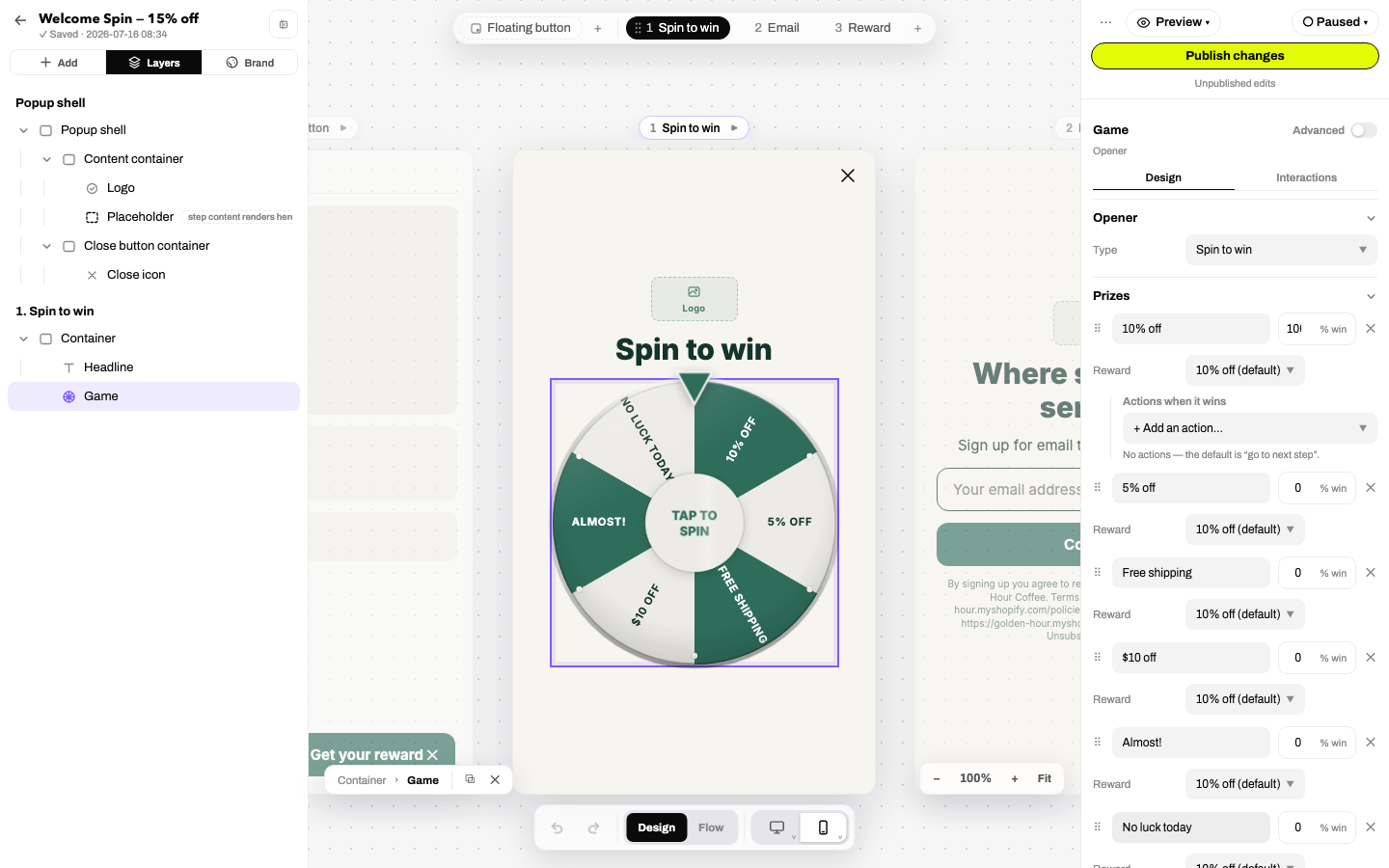
The inspector
The inspector adapts per element; here, a game's prize list and motion controls.
Selecting any element opens its inspector on the right, with up to three tabs: Content (the type-specific settings described above), Design (the style system) and Interactions (the action editor) where relevant. Quiz answers and questions add a Quiz tab for scoring. An Advanced toggle reveals the long tail: URL fields, custom icons, explicit breakpoint buckets, raw CSS.
NoteRight-clicking any element on the canvas offers Clone, Copy / Cut / Paste, Paste-and-replace, Copy/Paste style, Convert to component, Save to library, and Delete.